Weekly WIPs
Jun. 3rd, 2019 10:44 amOn a Monday! We went to see Godzilla on Saturday, and I came back and just went straight to bed. So I meant to post this yesterday and went to bed in the middle of the day with a migraine. So here we are on Monday. I got a lot of stuff worked on this week, and a lot of progress made on what I worked on. I feel like taking the weekend off didn't even matter in the long run.

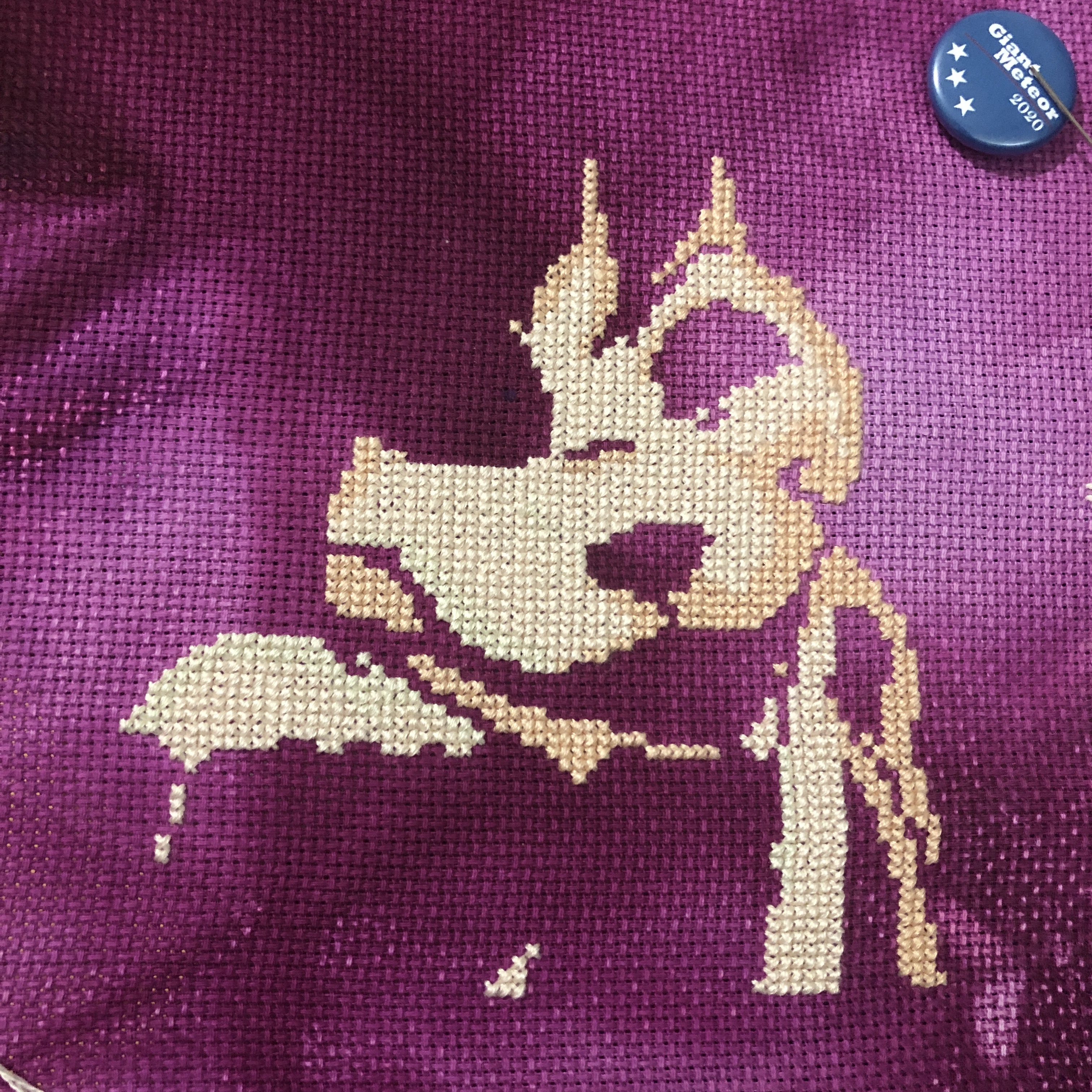
So close to done on this badge. The hair has made it take so much longer than I expected, but it already looks so good. I can't wait to get the black in there and really bring out the shape. Ordinarily with these pieces, I have to put a lot of time into adjusting the colours, because PCStitch is a fuckwit and doesn't look at the whole RGB value while converting, but looks for saturation first, and then value and hue. In the bigger projects, it doesn't matter too much, because there's a lot of colours happening at once and it still looks good as a whole. But with these small, simple designs, it means that your shadows and highlights will be completely different colours than your base. Her base was yellow, her shadow dark pink, and her highlight orange initially. While working on this, I've had to manually pick colours, and just use my chart to give me the shape, rather than following the chart properly. With her hair, I decided not to do that. She has yellow, orange, and red in there, all mingling together, and then shaded and highlighted as one. I did not want to sit there and figure out, "okay, this is a good spread for red, and this spread works for orange, and this one for yellow." It takes too much time, so I just YOLO'ed through. Her hair has enough variation of colour that it's turned out really well, and has exactly the kind of streaky, uneven look I was going for anyway.
Seriously though, fuck PCStitch.

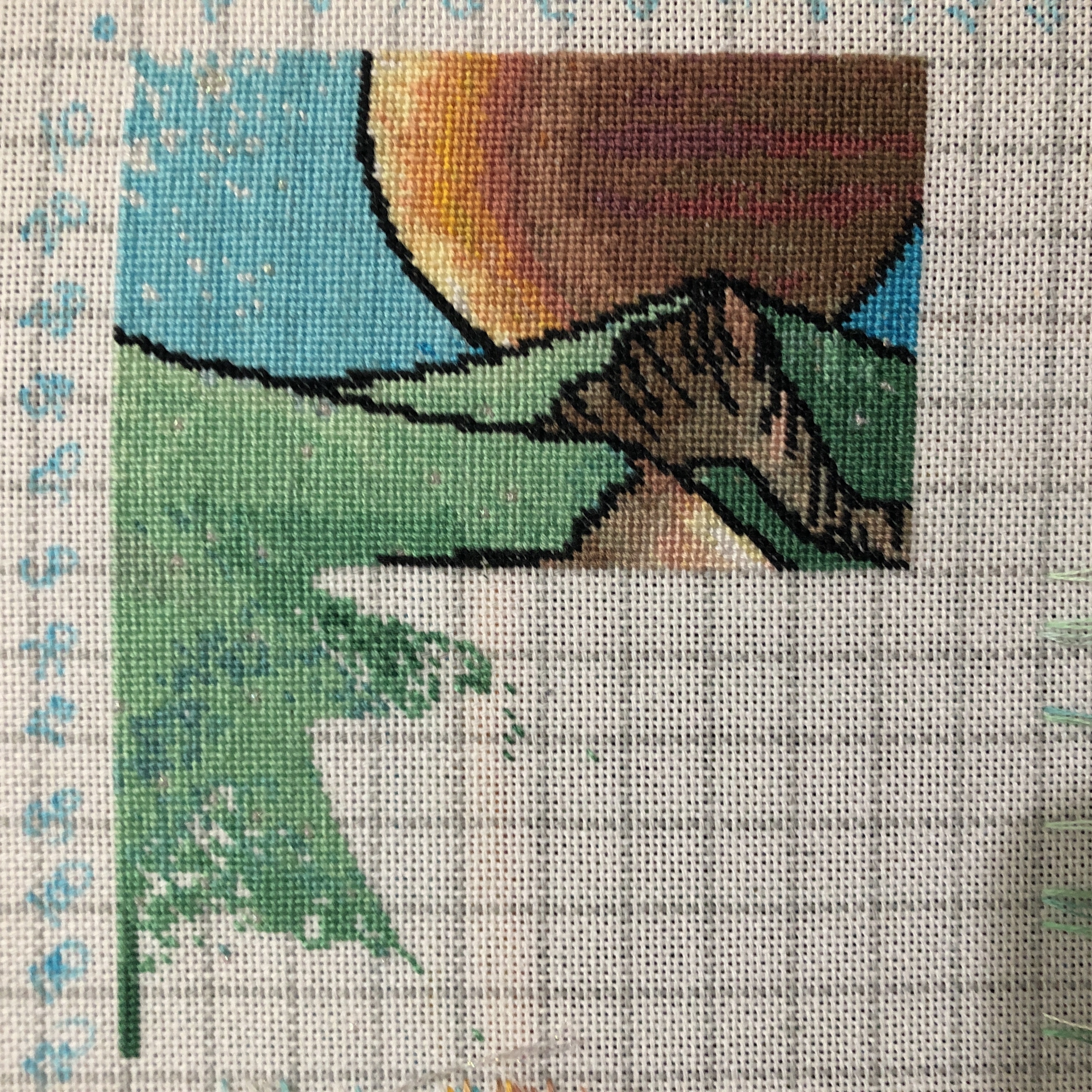
Page finish on Kermit! God, I love these greens, and I think my camera actually managed to pick up some of the ultra-saturated, high-value shades in there. I'm onto a page without a single stitch of black, which isn't going to be as tedious as background fill pages tend to be, because it's not full of confetti. That's one thing I'm really trying to avoid with this new style of designing patterns: minimal confetti for quick stitching, while still retaining a lot of detail. So far, with the three I'm working on in this style, that's been working really well. The horses are going to be an exception by design, because there's no good way to get gradients without confetti, and the goat is just an asshole for another reason that's entirely my own fault. But Kermit so far has been a breeze. He goes so quickly when I actually sit down to work on him.

It's going to take about a year to get to the horses in this one. But I'm so pleased with it already. I haven't got a whole lot done here this week, but I'm still loving the greens and they way they don't quite blend. The little bits of sparkle in this are going to look so good when the whole thing's complete. You can't really see them right now, because so far they're all in really light, unsaturated areas. But once I get into the darker blues and pinks and purples in the sky, those stars are going to stand out so well. I just really wish gridded 25ct wasn't so awkward to work on. I'm used to the lines being over the holes, dividing rows between stitches, but this fabric can't do that by design. It's so difficult to remember that stitching over the top and left-hand lines is stitch #1 in a square. I haven't made many mistakes on this, but every single one that I have made is because of that.

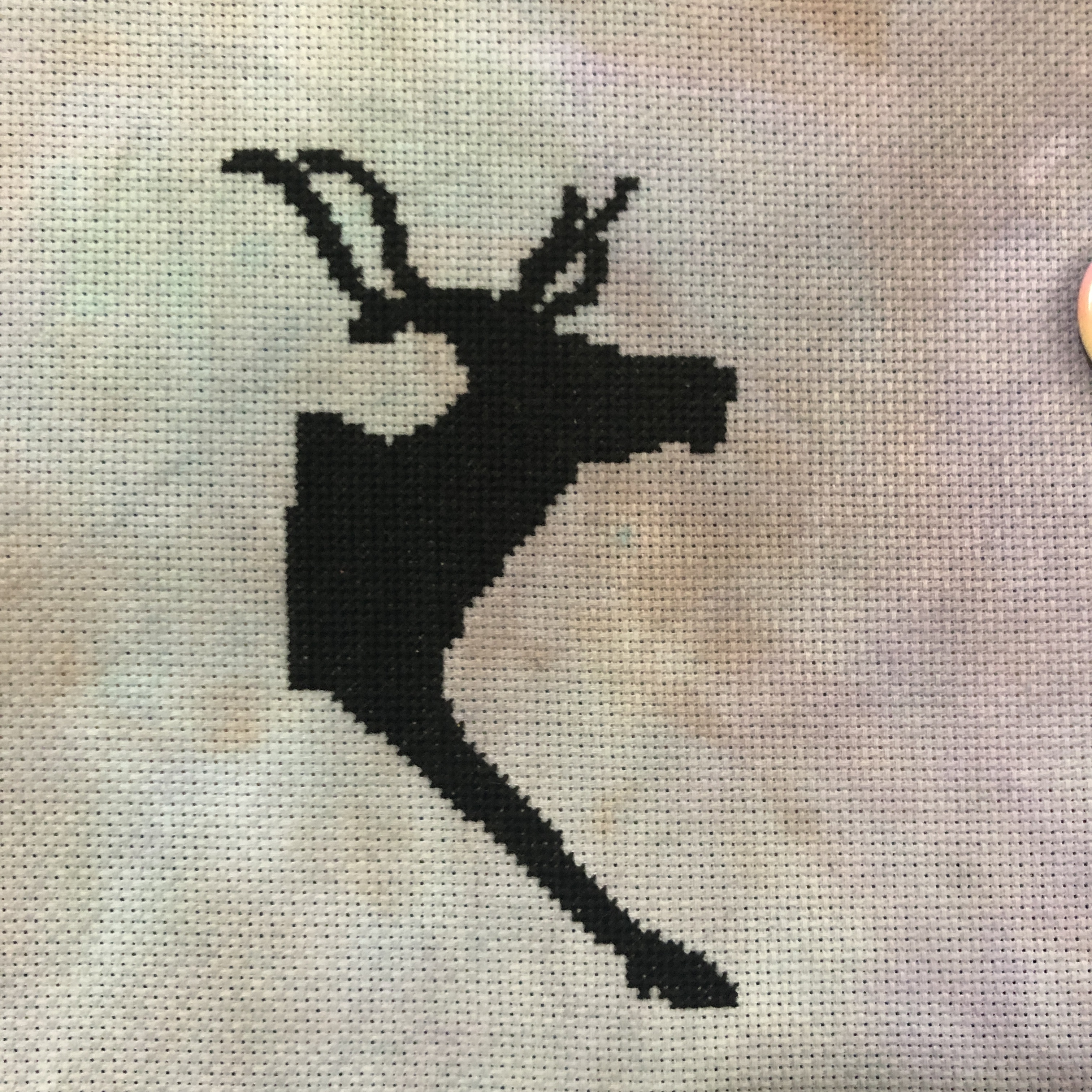
Some super simple reindeer on some Fiberlicious fabric. I actually got really far on this during a livestream, and then haven't touched it since. I had reindeer assets for a different project that I liked better, because they were winter reindeer, and all poofy. But those have disappeared, so I had to make new ones, and for the life of me, I could not find winter reindeer again. I found a couple of summer ones that had good poses and just turned those into vectors, but it's not quite the same. I have no idea where I even found the reindeer I'd used previously, and it's killing me. I might have to actually do that other project now so I can use the assets I paid for.

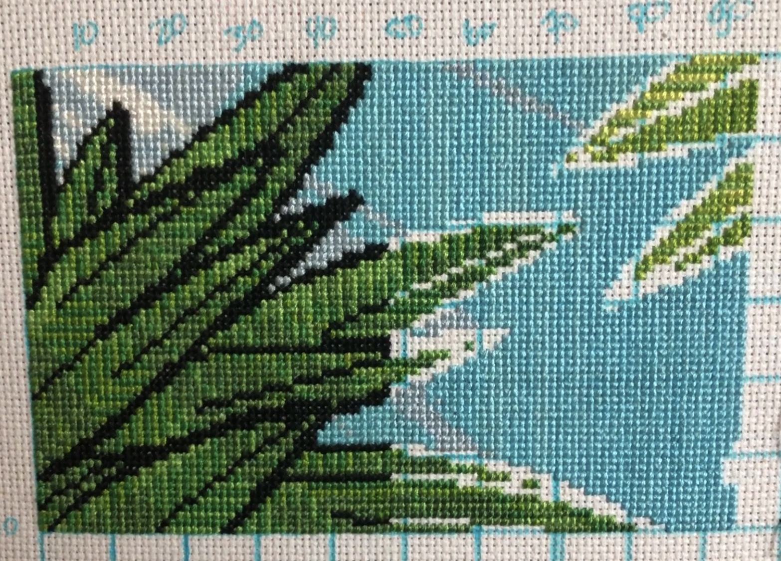
And last this week, the goat! I'll actually start getting to the goat itself on the next page. The stripes in the blue bother me a bit, but it's the sort of thing I don't think anyone else would notice, and you really can't avoid them when you have that many stitches of a single colour together. The reindeer also have stripes, but being black, you just can't see them. I've already on my second skein of that blue, and was so worried it was going to turn out to be another Hawkeye, but the colours are really consistent, and I can't even see where I switched. There's also a lot less of this particular shade of blue than I'd anticipated, because the tree on the right is a lot bigger than I remember making it. This one took so long to convert, because DMC doesn't have the best selection for blue, and the way PCStitch handles colour tends to turn blues and purples into mud.
I really like how you can see the difference the black makes here. The green looks so disjointed and wrong on page 2, even though it's the same green on page 1. Once I get the black down, it'll look really good.

So close to done on this badge. The hair has made it take so much longer than I expected, but it already looks so good. I can't wait to get the black in there and really bring out the shape. Ordinarily with these pieces, I have to put a lot of time into adjusting the colours, because PCStitch is a fuckwit and doesn't look at the whole RGB value while converting, but looks for saturation first, and then value and hue. In the bigger projects, it doesn't matter too much, because there's a lot of colours happening at once and it still looks good as a whole. But with these small, simple designs, it means that your shadows and highlights will be completely different colours than your base. Her base was yellow, her shadow dark pink, and her highlight orange initially. While working on this, I've had to manually pick colours, and just use my chart to give me the shape, rather than following the chart properly. With her hair, I decided not to do that. She has yellow, orange, and red in there, all mingling together, and then shaded and highlighted as one. I did not want to sit there and figure out, "okay, this is a good spread for red, and this spread works for orange, and this one for yellow." It takes too much time, so I just YOLO'ed through. Her hair has enough variation of colour that it's turned out really well, and has exactly the kind of streaky, uneven look I was going for anyway.
Seriously though, fuck PCStitch.

Page finish on Kermit! God, I love these greens, and I think my camera actually managed to pick up some of the ultra-saturated, high-value shades in there. I'm onto a page without a single stitch of black, which isn't going to be as tedious as background fill pages tend to be, because it's not full of confetti. That's one thing I'm really trying to avoid with this new style of designing patterns: minimal confetti for quick stitching, while still retaining a lot of detail. So far, with the three I'm working on in this style, that's been working really well. The horses are going to be an exception by design, because there's no good way to get gradients without confetti, and the goat is just an asshole for another reason that's entirely my own fault. But Kermit so far has been a breeze. He goes so quickly when I actually sit down to work on him.
It's going to take about a year to get to the horses in this one. But I'm so pleased with it already. I haven't got a whole lot done here this week, but I'm still loving the greens and they way they don't quite blend. The little bits of sparkle in this are going to look so good when the whole thing's complete. You can't really see them right now, because so far they're all in really light, unsaturated areas. But once I get into the darker blues and pinks and purples in the sky, those stars are going to stand out so well. I just really wish gridded 25ct wasn't so awkward to work on. I'm used to the lines being over the holes, dividing rows between stitches, but this fabric can't do that by design. It's so difficult to remember that stitching over the top and left-hand lines is stitch #1 in a square. I haven't made many mistakes on this, but every single one that I have made is because of that.
Some super simple reindeer on some Fiberlicious fabric. I actually got really far on this during a livestream, and then haven't touched it since. I had reindeer assets for a different project that I liked better, because they were winter reindeer, and all poofy. But those have disappeared, so I had to make new ones, and for the life of me, I could not find winter reindeer again. I found a couple of summer ones that had good poses and just turned those into vectors, but it's not quite the same. I have no idea where I even found the reindeer I'd used previously, and it's killing me. I might have to actually do that other project now so I can use the assets I paid for.
And last this week, the goat! I'll actually start getting to the goat itself on the next page. The stripes in the blue bother me a bit, but it's the sort of thing I don't think anyone else would notice, and you really can't avoid them when you have that many stitches of a single colour together. The reindeer also have stripes, but being black, you just can't see them. I've already on my second skein of that blue, and was so worried it was going to turn out to be another Hawkeye, but the colours are really consistent, and I can't even see where I switched. There's also a lot less of this particular shade of blue than I'd anticipated, because the tree on the right is a lot bigger than I remember making it. This one took so long to convert, because DMC doesn't have the best selection for blue, and the way PCStitch handles colour tends to turn blues and purples into mud.
I really like how you can see the difference the black makes here. The green looks so disjointed and wrong on page 2, even though it's the same green on page 1. Once I get the black down, it'll look really good.